
You’ve probably seen brands with more than one logo and thought, wait, do I need multiple versions too? Short answer: yes, and here’s why.
In this post, we’re talking about logo variations: what they are, why your brand actually needs them, and how having multiple versions makes it way easier to show up consistently across every platform, whether that’s Instagram, your website, packaging, or anywhere else your brand touches. I’ll also share logo variation examples to show you exactly which logo variations your brand really needs and how they work in real life. By the end, you’ll understand how different logo variations aren’t just a “nice to have,” they’re basically essential for a professional brand that people remember.
What happens if you only have one type of logo variation?
Let’s imagine having just one logo and using it everywhere. It might look something like this:

Compared to using different logo variations that work everywhere seamlessly:

Much better right?
And why is that?
Because not every platform (or product), where your logo appears is created equal. A website header has way more space than a tiny Instagram profile picture, and a social media icon is viewed differently than packaging or printed materials. Each use case has its own needs for legibility, scale, and impact. Plus, your audience interacts with each platform differently, so your logo has to adapt while still staying true to your brand. That’s why having different logo variations isn’t just helpful, it’s essential.
Now, let’s brake down the benefits.
Why small businesses need logo variations: key benefits
1. Legibility.
You have to make sure your logo stays crystal clear and easy to read, no matter where it is displayed – be it on different platforms, materials, or products. Legibility is especially important when your logo appears at small sizes, like on social media profile pictures, favicons, or product packaging. A logo that’s too detailed or crowded can quickly become unreadable, which makes your brand look unprofessional and inconsistent.
Having different logo variations ensures that every version of your brand mark communicates clearly, so your audience instantly recognizes your brand, whether it’s on a website, a tote bag, or a printed flyer. Logo variations are great for clarity, but if you want to make sure your entire brand feels cohesive across everything, let’s chat after this! Book a coffee chat here.

2. Flexibility.
Logo variations offer the freedom to adapt and fit seamlessly into various visual settings. Whether you simplify down to a single symbol or display your tagline or slogan in full, you always have the right option ready to go.
Think about it this way: a horizontal logo might look good across your website header but feel awkwardly squished on a vertical business card. Or maybe your full logo with tagline is perfect for packaging but way too detailed for a social media profile photo. By having different logo variations, you’re giving your brand the ability to breathe in every context, without losing recognition.
This flexibility also helps your brand feel more professional and intentional. Instead of forcing one logo to fit everywhere (and risking distortion, illegibility, or awkward cropping), you’re showing that your brand has been thoughtfully designed to work in all spaces, big, small, digital, or physical.

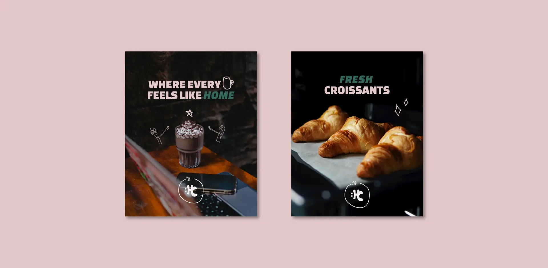
3. Consistency.
Maintaining a consistent brand image across different contexts is key to building recognition and trust. If your brand is all about sleek elegance, it’s going to look off when your profile picture on social media is a squished or badly cropped version of your logo. And people do notice these things, even if it’s just subconsciously, and it can make your brand feel less professional.
By having the right logo variation for each space, you ensure your brand always shows up polished and intentional. May it be your website, social media, signage, or packaging, each logo variation works together to tell a cohesive story. And when your audience sees that consistency across touchpoints, it builds familiarity, which eventually grows into trust and loyalty.
Consistency also prevents the dreaded “DIY brand vibe” (you know, when every platform looks slightly different and nothing feels connected). Instead, logo variations help you stay aligned and recognizable, no matter how small the space, how big the format, or how varied the platform.
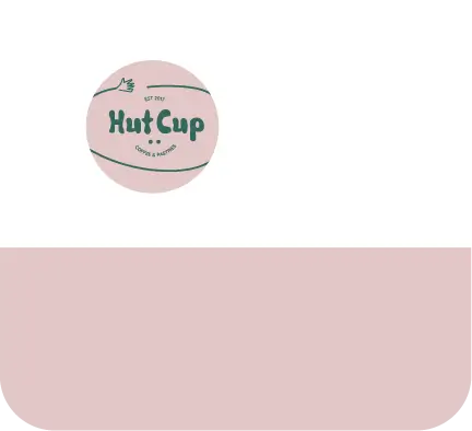


Must-have logo variations and how to use them
Primary logo

This is your main logo. It’s the one that usually includes your full brand name and, in some cases, a tagline or slogan, or the year the business was founded. This is the “face” of your brand aka the version most people will recognize and associate with your business.
Usage: Website headers, signage, packaging. Anywhere you have enough space to display all the details clearly. Your primary logo sets the tone for your brand identity, communicates your style, brand personality, and overall brand feel.
Common mistakes: Using this logo for tiny spaces like social media profile pictures or favicons. Because of all the details, it can appear cramped, hard to read, or unprofessional in small sizes.
Secondary logo

Think of this as your supporting actor. It complements the primary logo and is usually more compact or with a different orientation, horizontal or vertical. The secondary logo is designed to give you flexibility in situations where your primary logo might feel too large, the orientation doesn’t fit a specific space, or the design is too detailed. You can also have a few variations of your secondary logo, for example, one with only the name (without the tagline or extra details).
Usage: Wherever your primary logo can’t fit or doesn’t look its best. This could be a smaller website banner, social media headers, or even printed materials with limited space. The secondary logo ensures your branding stays consistent while adapting to different contexts.
Common mistakes: Trying to keep every single detail from your primary logo. Sometimes you need to simplify, remove a tagline, or adjust spacing so the logo works in the new context. Remember: clarity over complexity.
Submark
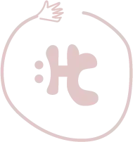
It’s a simplified version of your logo, often just a symbol or a unique aspect of your primary logo. Submarks are normally more compact and minimal. They help your audience quickly identify your brand, even when space is limited.
Usage: Perfect for social media profile pictures, app icons, favicons, or as a subtle watermark on images and packaging. Submarks let your brand show up cleanly and consistently without overcrowding the design.
Common mistakes: Overcomplicating it. The submark should focus on the single element that best represents your brand. Adding too many details defeats the purpose of simplicity and can make the logo hard to read at small sizes.
Favicon

A favicon is a very small 16×16 pixel icon used for your website browser tab. Even though it’s tiny, it plays a surprisingly big role: it helps your website look professional and recognizable when people have multiple tabs open.
Usage: Browser tabs, bookmarks, and any situation where your brand needs to be represented in a small digital space.
Common mistakes: Not having a favicon at all! It might seem minor, but skipping it can make your website feel incomplete or less professional. Make sure your favicon is simple and recognizable even at a tiny size.
Logo variation examples: See how Victoria Seguros uses different versions
Here’s a quick look at a project I did for Victoria Seguros, a personal brand for an insurance agent, and how she uses different logo variations across her branding. From the full primary logo on her website to a more compact secondary logo for other placements, and submark versions for smaller spaces, these primary and secondary logo examples show how the right variations keep a brand consistent, legible, and flexible across all touchpoints.
You can see the full Victoria Seguros case study here to explore the project and all the logo variations in detail.
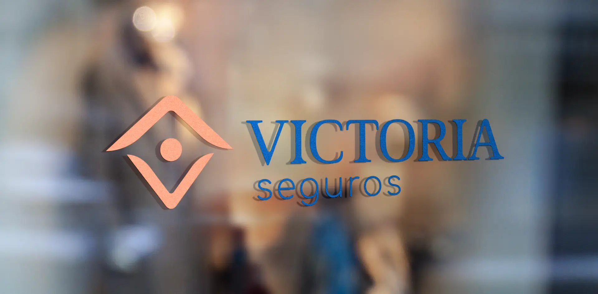

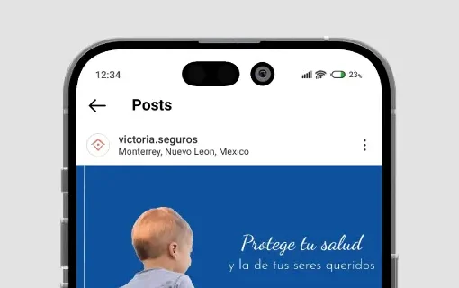
↳ Her primary horizontal logo appears on her website (shown on a tablet), her office window, and on stationery like cover letters and envelopes, setting a professional and recognizable look. The submark icon is used as her Instagram profile picture, keeping her brand clear and legible in smaller spaces.
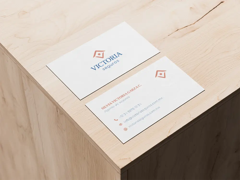
↳ The secondary vertical logo is used for her business card.
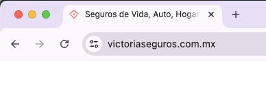
↳ The favicon on her website uses in this case the same submark icon.
Final thoughts: why your personal brand or small business needs logo variations
Logo variations for your brand make your brand legible, flexible, and consistent across all platforms. They’re not just design extras, but essential for showing up like a professional, whether it’s online, in print, or on packaging.
If you want your brand to look cohesive and ready for anything—online (internet) or in real life—logo variations are the key.
Logo variations: different types & examples: FAQs
Here’s a roundup of some extra questions I often get about types of logo variations. If you’ve been wondering about any of these, you’re not alone!
Do I really need multiple logo variations if I’m a small business?
Yes! Even small brands show up in lots of different places—social media, website, packaging, print materials, and more. Having multiple logo variations ensures your brand looks professional and consistent everywhere.
Can my primary logo ever be used for social media?
Sometimes, but be careful! Your primary logo usually has more detail, which can get lost in tiny spaces like profile pictures. That’s why a simplified secondary logo or submark is usually a better fit.
How many logo variations are enough?
At minimum, you’ll want:
- Primary logo (main brand logo)
- Secondary logo (more compact or differently oriented)
- Submark (symbol or simplified element)
- Favicon (tiny 16×16 browser icon)
This gives you enough flexibility to cover most platforms and use cases.
Can I create extra logo variations later?
Absolutely! Start with the basics and expand as your brand grows. Just make sure every new version still aligns with your brand style and stays recognizable.
Do I need different color versions of my logo variations too?
Yes! Often you’ll need:
- Full-color logo variation for standard use
- Monochrome or single-color logo variation for specific backgrounds
- Reversed logo variation for dark backgrounds
This keeps your logo variations legible, versatile, and professional no matter where they appear.
Want to give your branding a little boost?
If you’re curious about leveling up your brand visuals, you can check out my brand design services to see how I help you show up more consistently and professionally. And if you want to chat about your brand, I’m always available for a quick check-up.

Meet the writer

Emily Ruven is a brand and web designer who makes it easy (and more fun) for small business owners to grow with pro branding that feels intentional, shows your value, and takes a little weight off your shoulders.


